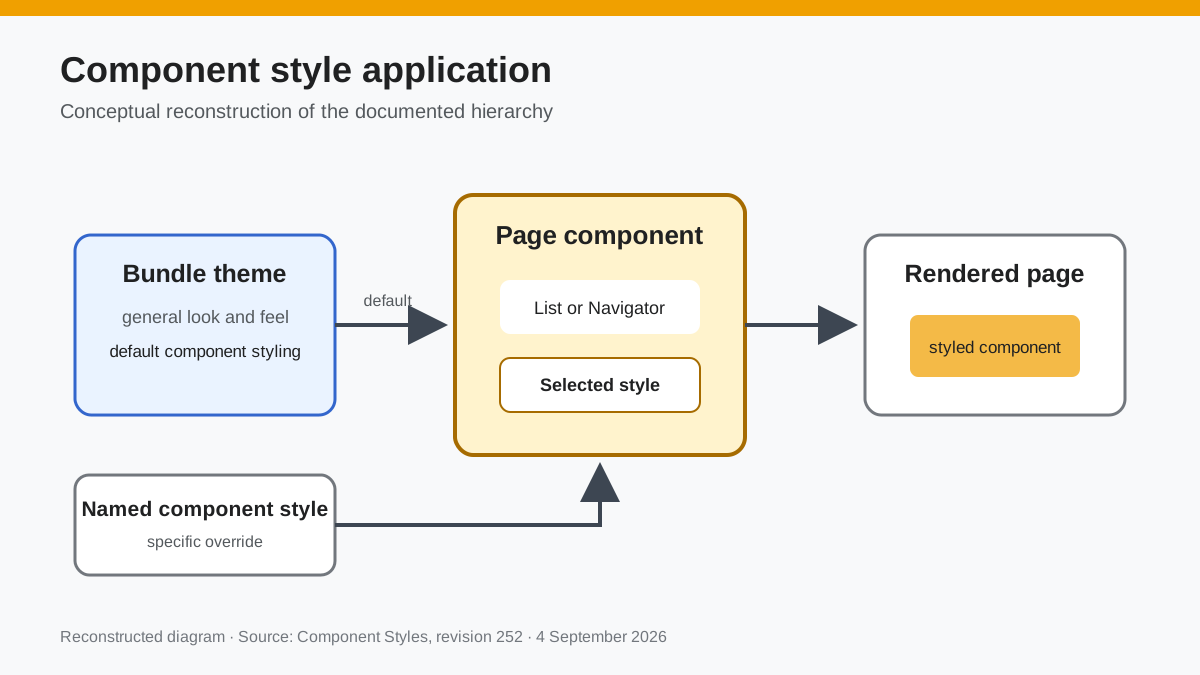
Bundle Themes allow complete control over all of the general look and feel for a bundle, and are generally sufficient for all of your styling needs. However, there are cases where you need to style a component differently depending on which page it is displayed on; Component Styles provide this. For example, suppose you have Navigators on the left of most of your pages that are styled based on the Bundle Theme. But, on a specific page, you have a second navigator displayed that you want to style differently. To do this, you need to create a Navigator Component Style and then apply that style to this second Navigator.
Component Styles are found on the Theme Details page:
 Documentation image “ThemeComponentStyle.png” is unavailable.
Suppose that we want to have some lists display with a different background color. Normally, the list displays like this:
 Documentation image “ListNoStyle.png” is unavailable.
Create a new Component Style for the List component and give it a name:
 Documentation image “ListComponentStyle.png” is unavailable.
Now, when you add or edit a List component on a page, you have the option of selecting a Component Style for that specific list on that specific page:
 Documentation image “ListComponentOnPage.png” is unavailable.
The list will now display with your new styling (in this case, just a background-color change):
 Documentation image “ListOnPage.png” is unavailable.
Reconstructed diagram
Reconstructed diagram: a conceptual visualization of the process described on this page.